UpdateMTX: Tickets
Clearer Edges and Stronger Colors in MTX
The Tickets list and the ticket view are easier to read at a glance, with stronger contrast in both the light and the dark theme.
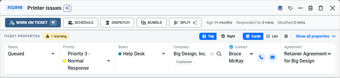
- Clearer sections. In the light theme, the lines between the header, the buttons, the notes and the properties are darker, as are the borders of the property groups and the notes.
- Buttons and pills. Schedule, Dispatch, Bundle and Split, and the status, priority and board pills under the ticket's title, have darker edges.
- Statuses. In the light theme, each status in the Tickets list is a solid color, as it already was in the dark theme.
- Ticket numbers. The ticket number buttons, and the other blue buttons in a row, are a darker blue so the number is easier to read.